Component Library
Examples of the currently available components in Flynt

Examples of the currently available components in Flynt
Most of the Components showed on this page can be displayed in one of four themes. The options are (none): white background, Dark: dark background, Light: light background, Hero: Brand color background. The theme can be chosen under the “Options” tab in the component editor.
Displays larger amounts of info within a drop down Accordion. Works well for information that not all users need to see.
Provides the user with information and calls them to take action upon that info by clicking a button. Version 1 provides the option of one or two CTA Buttons, which are located on the right of the informative text.
Provides the user with information and calls them to take action upon that info by clicking a button. Version 2 provides the option of one CTA Button, located below the informative text.
Displays statistics or financial information. Each figure has an icon to represent it, and the numbers count up to their value as the users views the component.
This component is not visible. The collapse block reduces the vertical space between components. Simply move the component in between components with same color themes.
It is used between the WYSIWYG Component below this and the Block: Image Component.
Displays an image. The only option provided is the display size of the image.
Allows for a larger amount of content on either side of an image.
When multiple are used next to each other, it may look better to place a Block: Collapse in between them, like done here.
Lorem ipsum dolor sit amet, consectetur adipiscing elit, sed do eiusmod tempor incididunt ut labore et dolore magna aliqua. Ut enim ad minim veniam, quis nostrud exercitation ullamco laboris nisi ut aliquip ex ea commodo consequat. Duis aute irure dolor in reprehenderit in voluptate velit esse cillum dolore eu fugiat nulla pariatur. Excepteur sint occaecat cupidatat non proident, sunt in culpa qui officia deserunt mollit anim id est laborum.
In this Component the image and text have almost equal weight, but focus is on the image, as it’s having a parallax movement while scrolling past the component. Image file type must be .jpg
Lorem ipsum dolor sit amet, consectetur adipiscing elit, sed do eiusmod tempor incididunt ut labore et dolore magna aliqua. Ut enim ad minim veniam, quis nostrud exercitation ullamco laboris nisi ut aliquip ex ea commodo consequat. Duis aute irure dolor in reprehenderit in voluptate velit esse cillum dolore eu fugiat nulla pariatur. Excepteur sint occaecat cupidatat non proident, sunt in culpa qui officia deserunt mollit anim id est laborum.
In this Component the image and text have equal weight, though the image isn’t resized proportionally but is sized according to the text height and gets cropped when resized.
Video embed, with a poster image and overlaying play button showing before the video is started.

Provides a simple environment for formatting text in any way needed. It supports a few font sizes, left or center justification, as well as options such as Bold, underlined, italic, links, and lists.
Identical to the main Wysiwyg Component, except that it wraps the text into two columns.
Lorem ipsum dolor sit amet, consectetur adipiscing elit, sed do eiusmod tempor incididunt ut labore et dolore magna aliqua. Ut enim ad minim veniam, quis nostrud exercitation ullamco laboris nisi ut aliquip ex ea commodo consequat. Duis aute irure dolor in reprehenderit in voluptate velit esse cillum dolore eu fugiat nulla pariatur. Excepteur sint occaecat cupidatat non proident, sunt in culpa qui officia deserunt mollit anim id est laborum.
This Wysiwyg adds a sidebar to the left side for smaller amounts of information.
Up to 4 grid items with an image and WYSIWYG each. Can be used for any kind of static content. The images can optionally functions as links and a CTA Button can be enabled as well. Has an optional card style.
Lorem ipsum dolor sit amet, consectetur adipiscing elit, sed do eiusmod tempor incididunt ut labore et dolore magna aliqua. Ut enim ad minim veniam, quis nostrud exercitation ullamco laboris nisi ut aliquip ex ea commodo consequat. Duis aute irure dolor in reprehenderit in voluptate velit esse cillum dolore eu fugiat nulla pariatur. Excepteur sint occaecat cupidatat non proident, sunt in culpa qui officia deserunt mollit anim id est laborum.
Lorem ipsum dolor sit amet, consectetur adipiscing elit, sed do eiusmod tempor incididunt ut labore et dolore magna aliqua. Ut enim ad minim veniam, quis nostrud exercitation ullamco laboris nisi ut aliquip ex ea commodo consequat. Duis aute irure dolor in reprehenderit in voluptate velit esse cillum dolore eu fugiat nulla pariatur. Excepteur sint occaecat cupidatat non proident, sunt in culpa qui officia deserunt mollit anim id est laborum.
Lorem ipsum dolor sit amet, consectetur adipiscing elit, sed do eiusmod tempor incididunt ut labore et dolore magna aliqua. Ut enim ad minim veniam, quis nostrud exercitation ullamco laboris nisi ut aliquip ex ea commodo consequat. Duis aute irure dolor in reprehenderit in voluptate velit esse cillum dolore eu fugiat nulla pariatur. Excepteur sint occaecat cupidatat non proident, sunt in culpa qui officia deserunt mollit anim id est laborum.

[shortcode]
Simple formatted text with a full width background color to draw attention to the Call to Action (CTA) button.
Full width image with a separate mobile image upload to optimize the crop. Optional formatted text as overlay with a fading background to ensure readability.

A full width image slider with separate mobile image upload for each slide to optimize the crop. Optional formatted text is shown as an overlay.

Consectetur adipiscing elit, sed do eiusmod tempor incididunt ut labore et dolore magna aliqua. Ut enim ad minim veniam, quis nostrud exercitation ullamco laboris nisi ut aliquip ex ea commodo consequat.
Focuses on content and cuts the fixed height image off starting from the outer side. Text can be positioned on the left or right side. Any image aspect ratio can be used and will extend outside the container if too wide.

Add any number of icons and optional text to highlight features or services. Optional link below icon. Includes a center option that will also wrap the icon in a colored circle.
See what’s happening
Highly Awarded Institution
Intelligence Thrives Here
Upload logos (gif, jpg, png or svg) that will line up centered. Allows links for each logo and has an optional card layout.
Add your social media platform links and they will show up as predefined svg icons. Optional formatted text above the icons.
Simply drop any images on the gallery field, order them by drag & drop and optionally add a caption per image. No need to worry about the photo selection as any image ratio will fit into the slider.


Drop any images on the gallery field, order them by drag & drop and optionally add a caption per image. Any image ratio will fit into the slider. It always covers the full width of the website container and comes with a thumbnail preview navigation.


Drop images on the gallery field, order them by drag & drop and optionally add a caption per image. Crops images into a predefined ratio, centers the active image slide and crops the previous and next image.


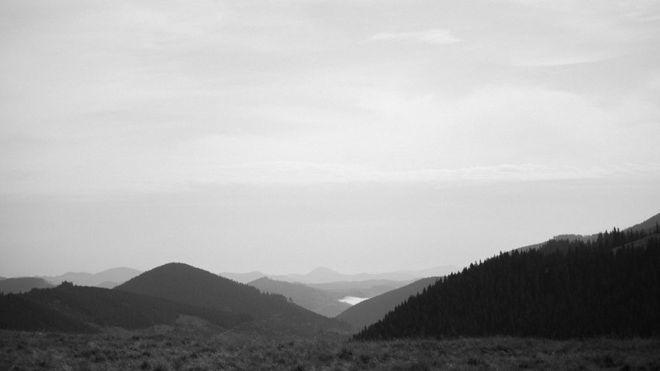
This issue of BeFriending Creation invites us to reconnect with the land, the trees, and the soil, to “find steady ground” in our spiritual practices and in our communities. Enjoy an issue filled with great Quaker writers and thinkers.